
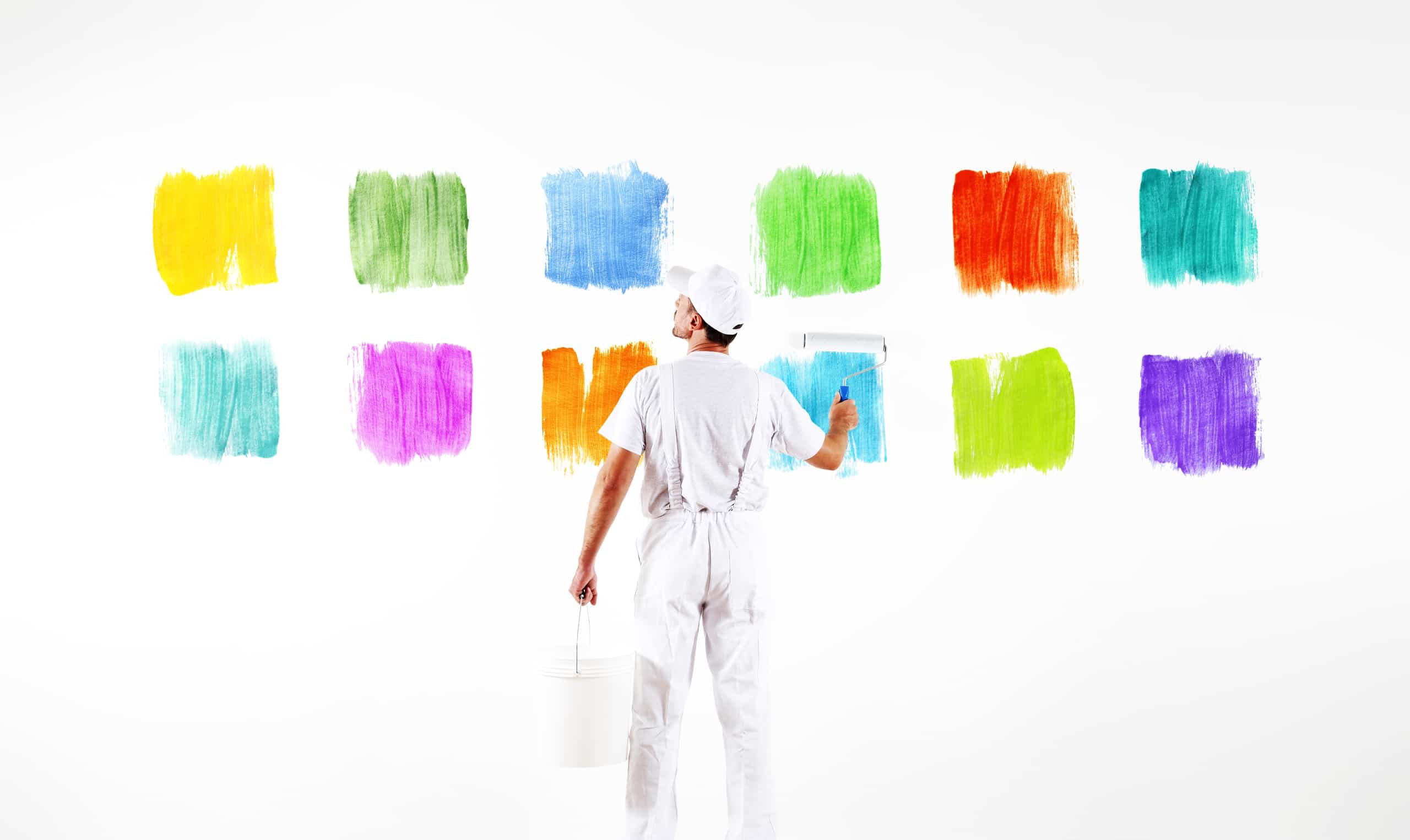
How Color Describes the Perception of your Website
The color of things we see influences our mood in more ways and not just one. Inclusive research has shown that color influences not just our attention, but also our emotion and response. We know that the site context and how it is performed is very important, but what if we’re trying to show through attractive design elements and other non-typographical content?
A website may have a clear and expressive context, but the choices of colors for background and other elements can express a profound message. Design objects or element such as the selection of color can attract visitors just as strong a message of a clear context.
Let’s see what each color means and how it alone can change the audience response.
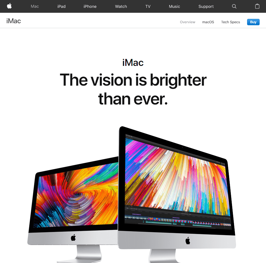
White
White is compared with light, morality, honesty, purity, and virtue. It is reflected to be the color of perfection.
In most websites, white is compared with neatness and coolness because it’s the color of ice. You can use white to recommend simplicity in high-tech merchandises. The website for the iMac in “Apple Website” is the best example of using white colors to reinforce the concepts of simplicity and cleanliness.
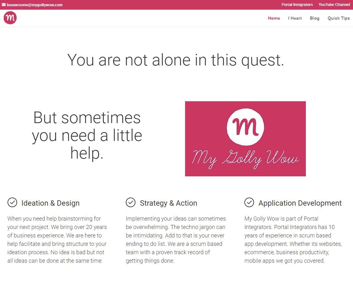
Pink
The color pink is a humane and sustained color. It is a fresh color that calms and making the audience feels relax. It is compared with admiration, romance, and love. The website of “My Golly Wow” gives the audience a relaxing and calming user experience.
Blue
The color blue, in vivid hues, is recognized to have a calming and soothing effect. Deeper or darker shades of blue excite the mind into thinking more precisely. But, these deeper shades can also produce feelings of darkness for some audience. The website of “Portal Integrators” is an excellent example of how the blue color creates a calming, peaceful user experience.

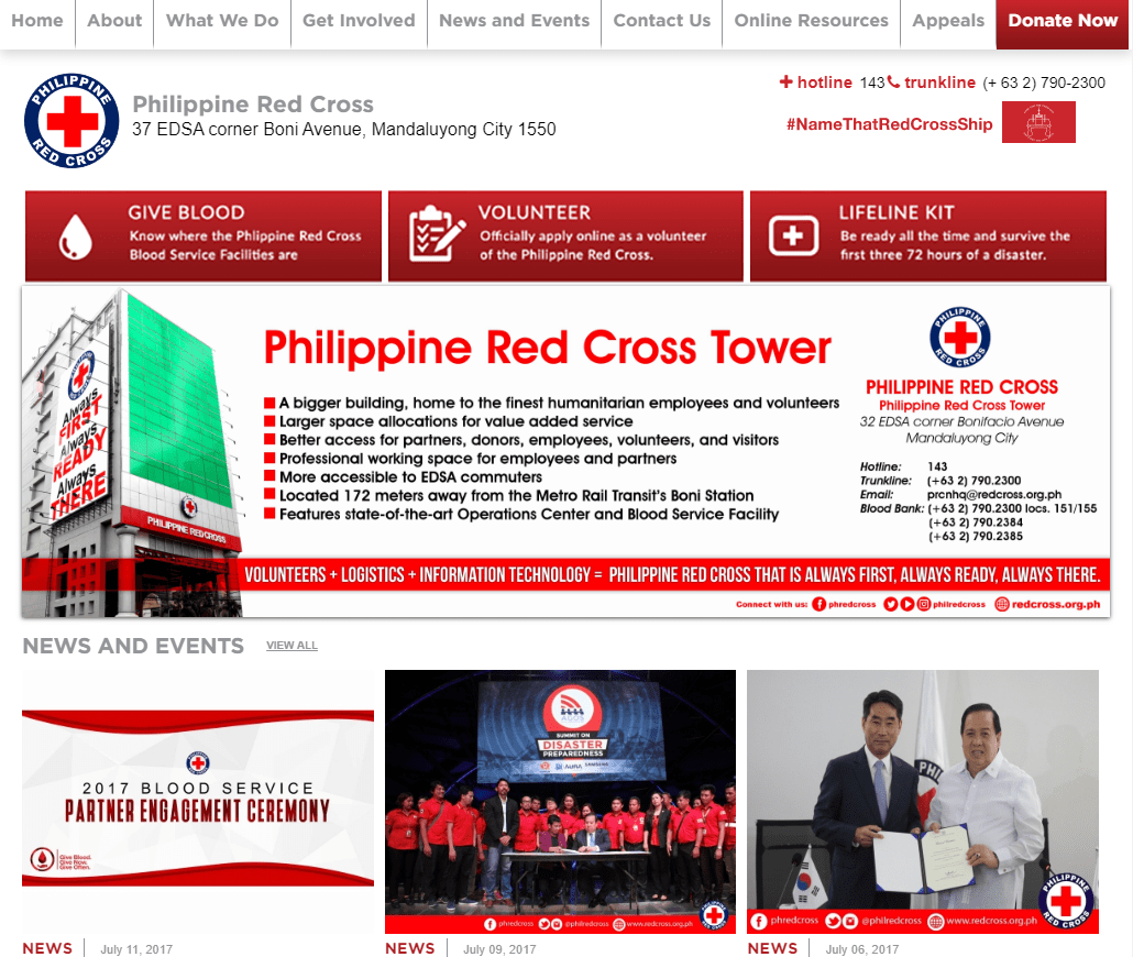
Red
The color red raises the heartbeat and causes quicker breathing. It is a supreme extreme and color and as such, is connected with aggressiveness and desire. Red is also associated to excite our appetite because it’s the color of the Apple. In most websites, red is associated with an “Action” color. The website for “Philippine Red Cross,” an association offering blood donation, is an excellent example of using the color of red to encourage visitors to take action.
Always consider connecting the color of your site on the content. Colors typically reinforce the message that the content is saying. So take a look on your site, is the color fit to the content? Or it needs a color facelift?
Color Impact
Color has a great impact on individual behaviour and it is better recognized now than at any time in history.
Color Influence
Color influences your bottom edge in packaging, branding, depths, web design, goods design and look.